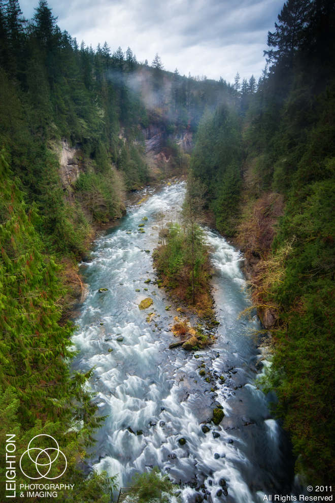
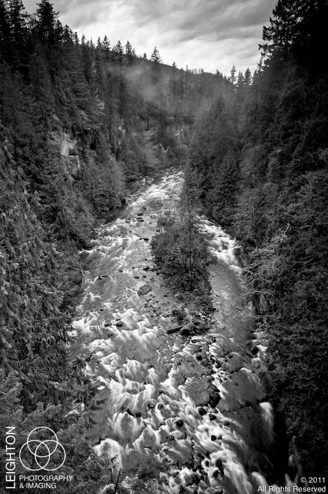
I may need my readers’ help with this one….. I am stuck between two images that are very similar and shot at very nearly the exact same spot. One is in color, the other on black and white.
Last week there was a break in the constant rain and I went on a “not-well-thought-out nature photography destination” type of trip. I just headed east of my new home toward the mountains where I’ve been seeing some snow. Not planning to go far, because the rain started again, but I was feeling a creative rush and I just wanted to visit somewhere new to me. This meant past the grocery store and the elementary school we visited with my preschooler a couple of weeks ago. Besides, the light was perfect for the type of landscape work I love to shoot – moody, gray with teasing hints of sunlight but with a lingering sense of menace. I found what I was looking for twenty minutes from my driveway.
This is the image I was originally looking for after I found this river and scouted out the best angles. As I was waiting for breaks in the wind and rain and enduring the looks of locals looking at me like I was out of my mind standing in the middle of a single-lane bridge with all my gear, I thought the contrast in what I was seeing might call for a change – maybe a black & white treatment. So I decided to shoot for both.
Shooting in black & white is something I always greatly admire in other photographers but something I seldom do. I kind of leave that to “The Greats”, and more or less go my own way and style as I have done over the years. For many, the general template style is that of Ansel Adams. Being from Southwest Florida, our local master nature photographer Clyde Butcher was the one who made an everlasting impression on me first – long before I knew who Mr. Adams was (I even saw him once in the Everglades totally focused on his craft – looking like a sort of “Swamp-Santa”). Since I was there, had my gear with me, and the lighting was spectacular, I pulled out my old-school red filter and started shooting. Something wonderful about old film filters… they add so much drama to an image that isn’t so easily created in post-production in the digital studio.
My question to you… which one do you like better? The color image or the black & white? I am at an even 50/50.
Sharing and commenting via the social media links below will help me greatly, and is much appreciated.
Thank you in advance!
ALL IMAGES ARE AVAILABLE FOR PRINT OR DIGITAL DOWNLOAD. JUST CLICK ON THE IMAGE AND ADD TO CART.


Beautiful shot Rich..both ways are nice but for me the color really sets off the canyon~
Hi Rich! Since I love antique photographs so much, I usually lean towards black & white, but with these photos, I think the color one better portrays the majesty and power of this river. Of course, they are both equally stunning.
I hope you and your beautiful family are still loving life in the Great Northwest! You are dearly missed in the Greater Southeast ;). Love & Peace
I chose the color for this one. I too admire B&W and would like to see more of it..but..the B&W version emphasizes the white water too much for me, and draws away from what I feel should be the focal point of the composition..The island in the stream..the brows, yellows and greens therin.
Thanks so much for your comments! I was more drawn to the color version too… but I liked both so much that I decided to keep both. 🙂